This Foothill Ranch, California home remodel was a full house renovation that I worked on from the beginning concept phase through the final accessories styling session. There are a lot of details that I want to share, so I decided to break the posts up into three parts. This first part with cover the main living spaces, including, the music room, family room, kitchen, and guest powder room.
Music Room
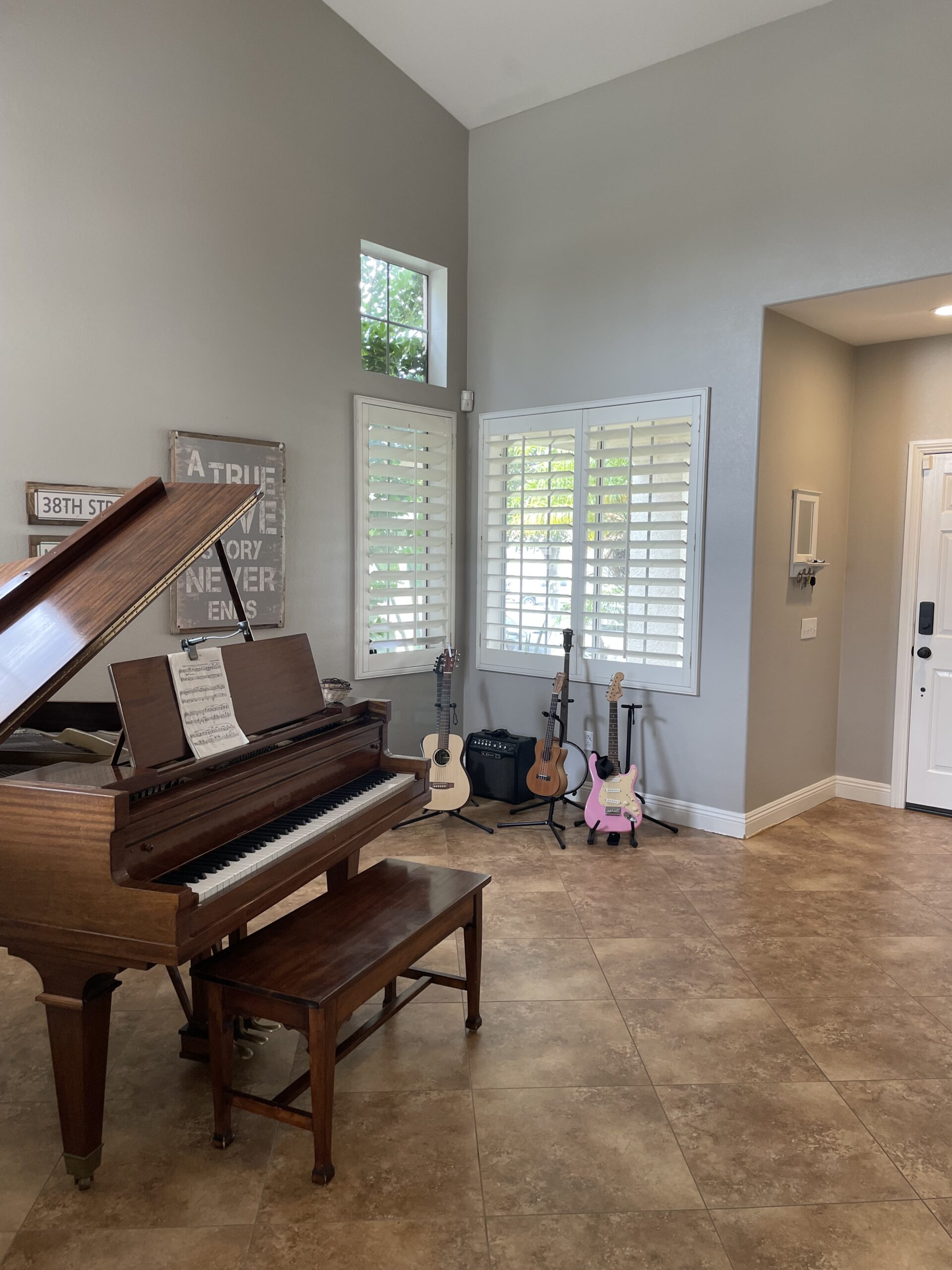
When you enter this home you walk right into a small front room that my clients were using for their beautiful grand piano and some of their guitar collection. Even though the ceiling is tall, the room felt a bit dark with the brown tile floor, gray walls and heavy louvered shutters covering the windows.
Before
Since this home has a very open floor plan, the new design for the “music room” was carefully thought out in consideration with what decor elements would be going on in the other spaces. The whole house would be getting new flooring, updated window coverings, and a change in paint color.
The Design
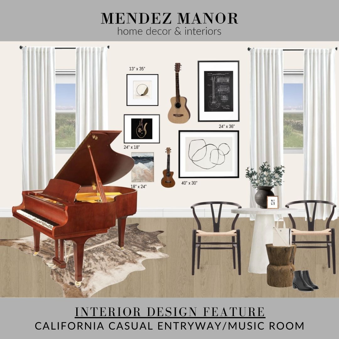
The plan was to leave the grand piano where it was and add a small table and chair next to the front door, to create more of an entryway space. We used the Willy Table from Crate & Barrel (which is a lovely option if you need a round entry table or side table) and two black and natural wishbone chairs. We also added a rustic wood stool for dropping a handbag, notebook, wallet or any other entryway type items. All three elements create a beautiful layering of color and texture!
Shop The Look
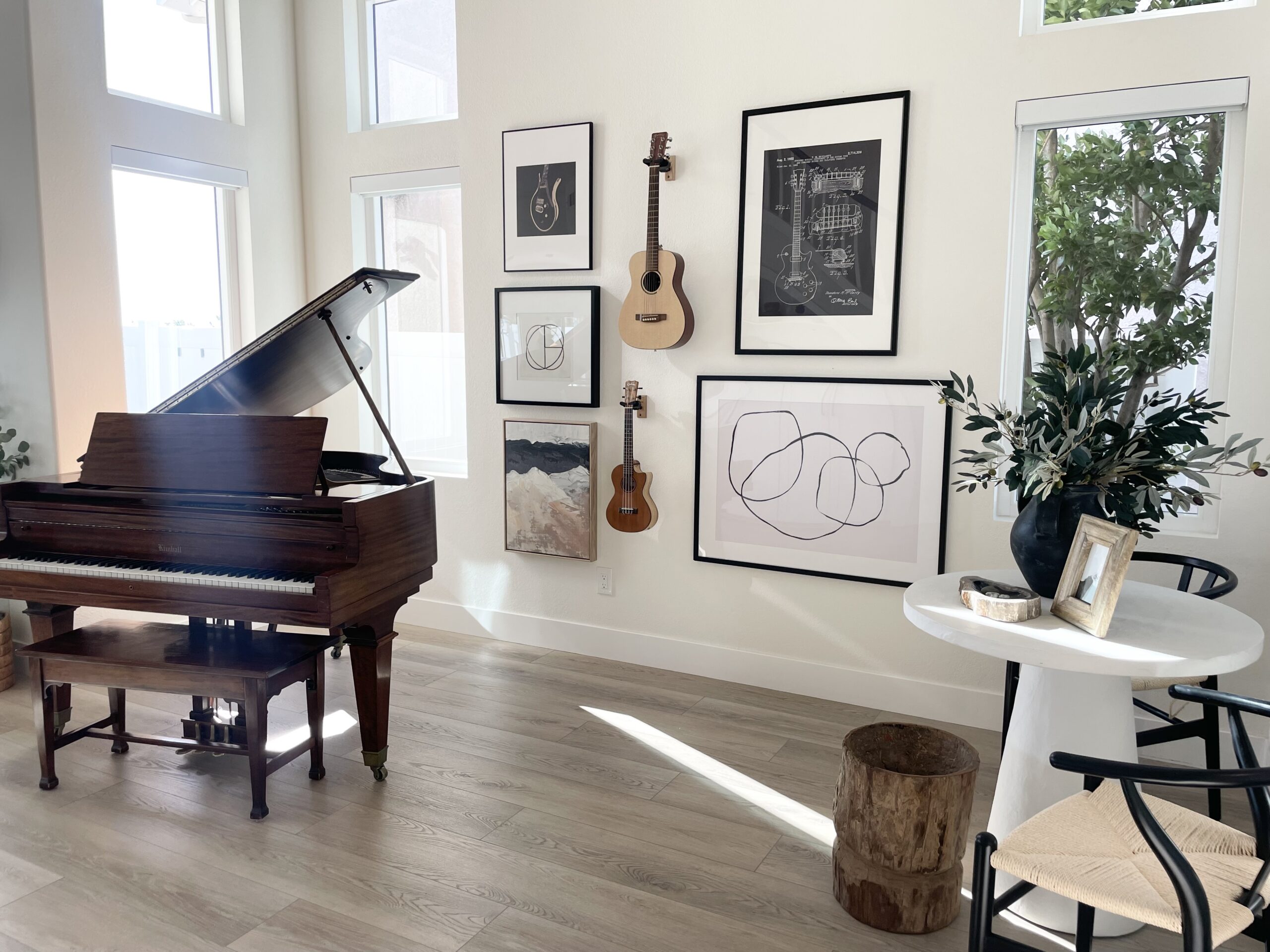
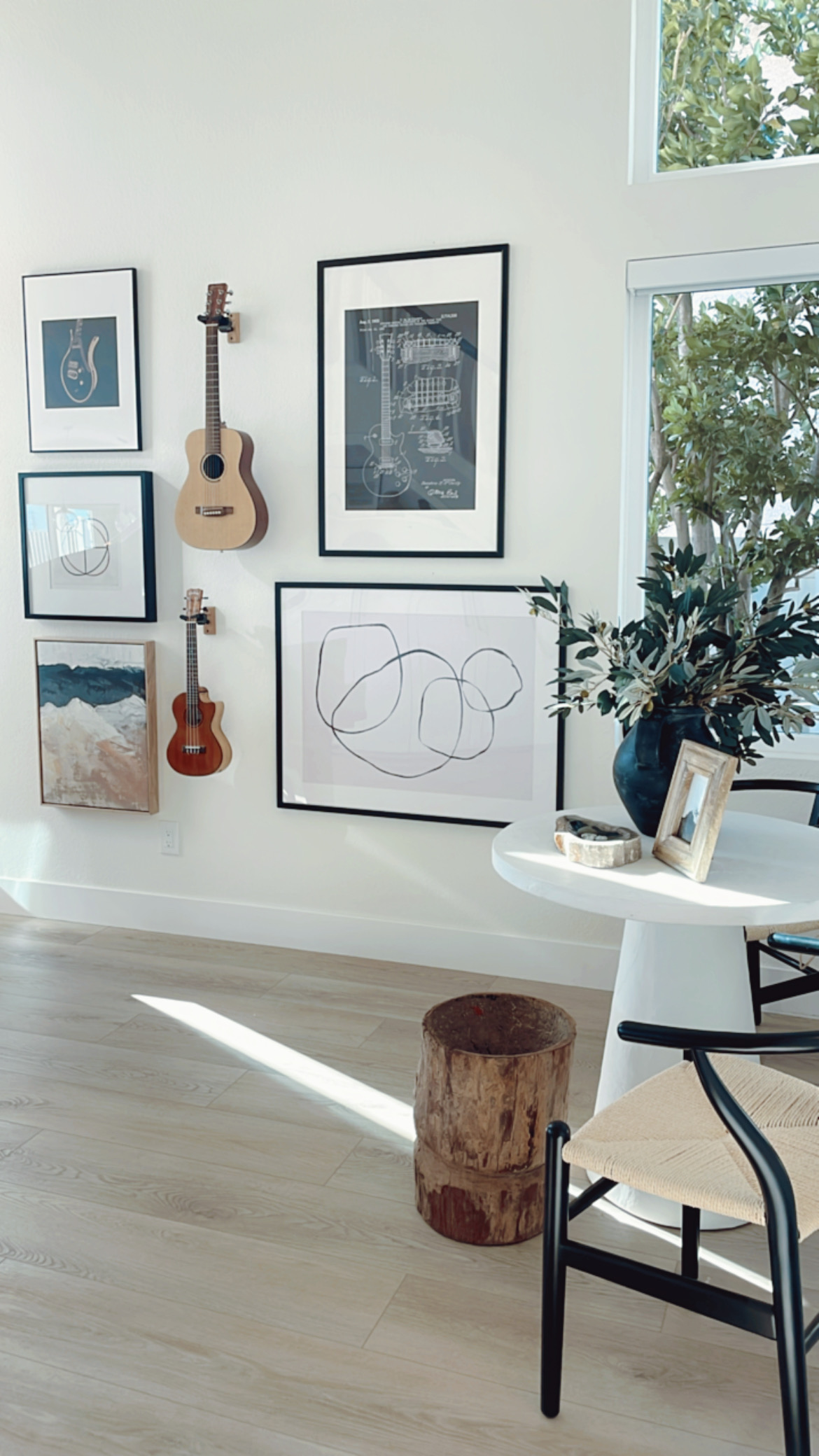
For the gallery wall, we started fresh with new artwork, and planned to incorporate one of our client’s guitars and one ukulele. We chose large art pieces to fill the entire space and were careful to curate works that had a musical element.
The flooring used is the Pikes Peak collection by Christina Collection Flooring and the paint color is Dunn Edwards Swiss Coffee in a flat finish.
After
We guided our client through the process of arranging the gallery wall by first hanging pieces of kraft paper cut to the same size as each art work we were planning to use. This ensured she had all the right spacing before actually nailing into the wall. You can see some progress photos and videos of this process in the highlight titled, “Project 10” on my Instagram page @mendezmanor_interiordesign
Direct link to the highlights here: https://www.instagram.com/stories/highlights/18027928210390978/
Built-In Storage
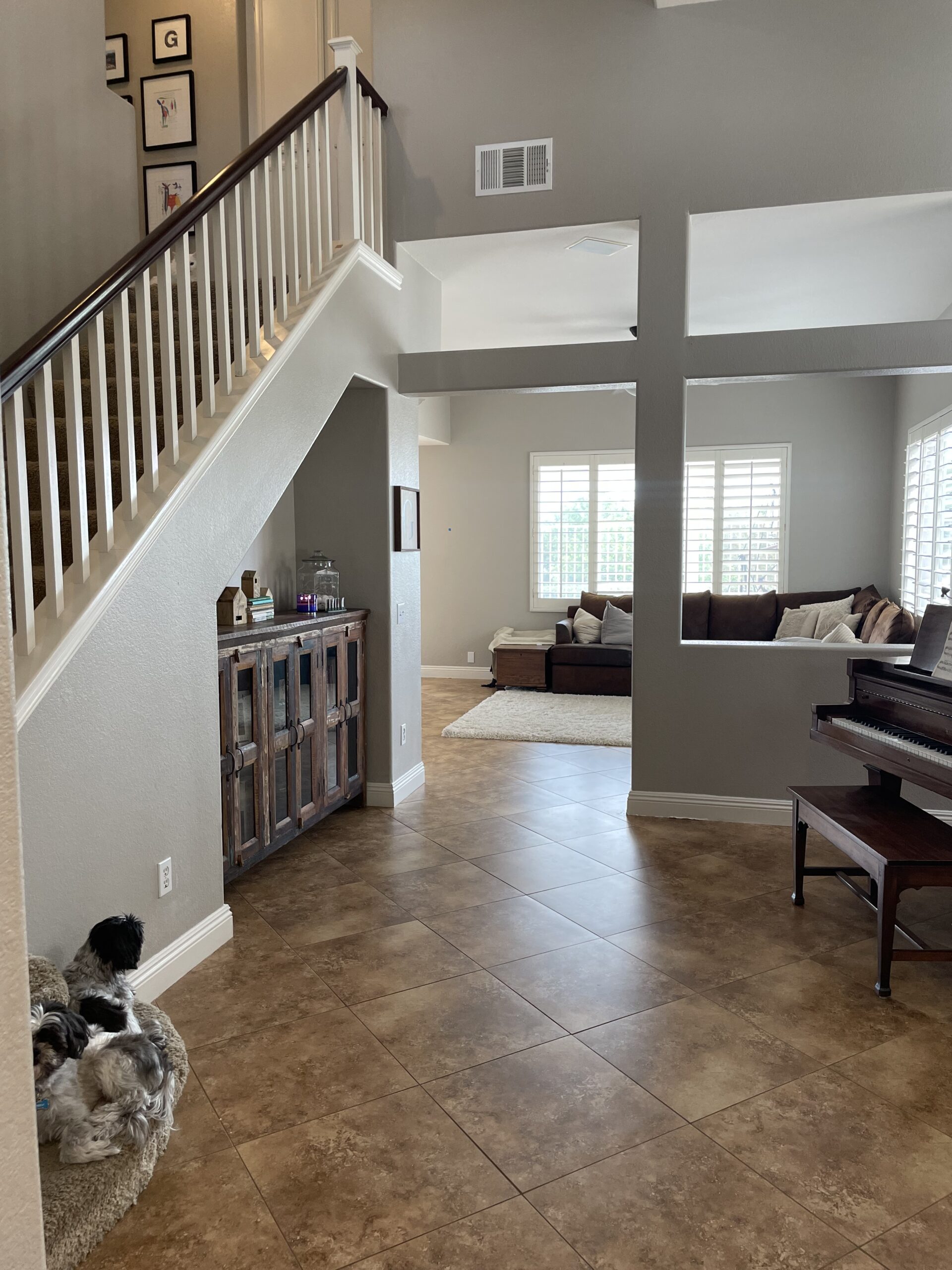
Across from the piano in the music room, there was a cut-out nook in the wall under the stairs leading to the second floor. To be honest, I had never seen a wall cut-out quite like this before!
Before
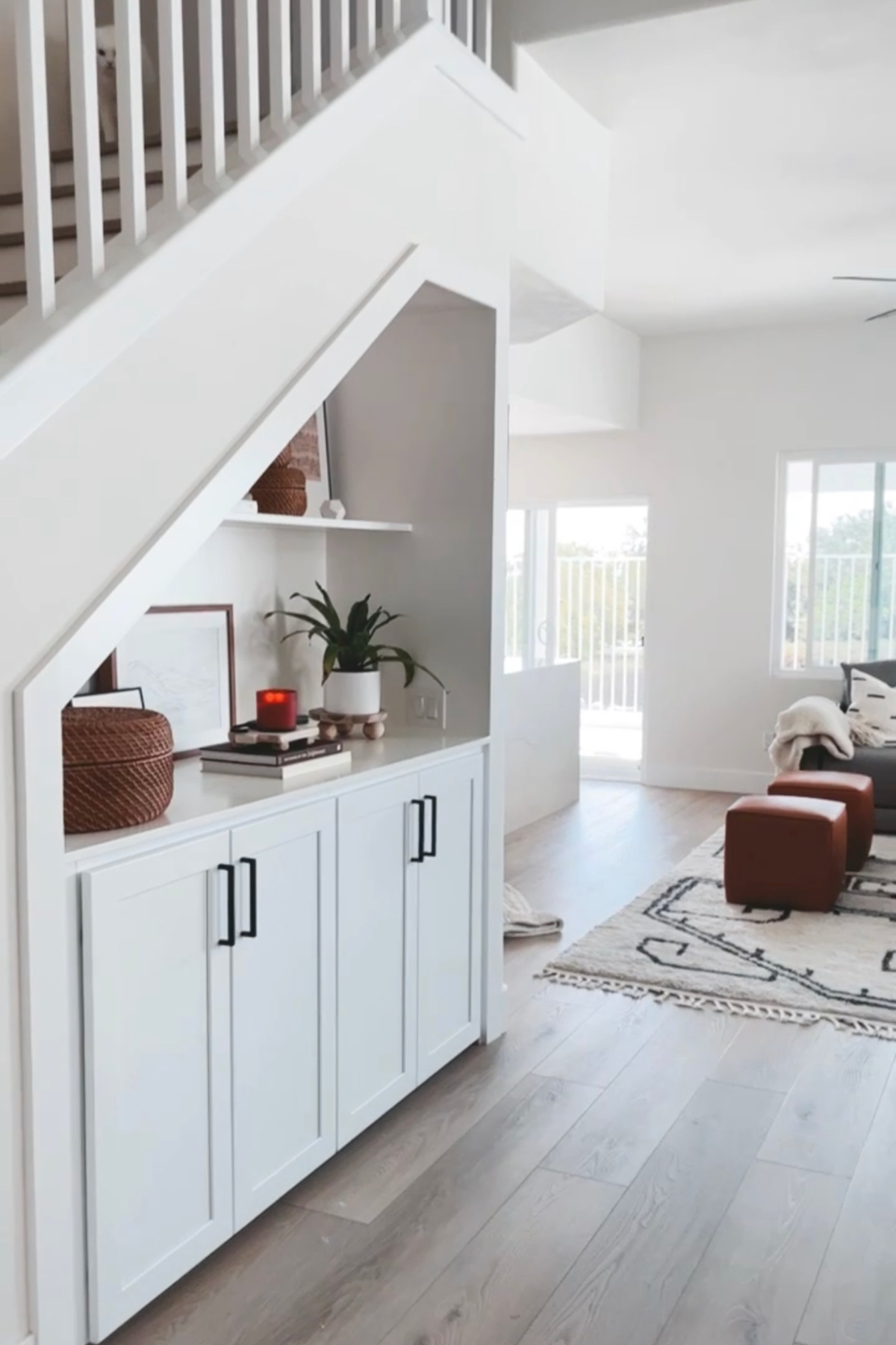
My client was using the space as best as possible with the perfect size console table. However, the opportunity to seamlessly blend everything together using built-in storage provided an even better solution!
The Design
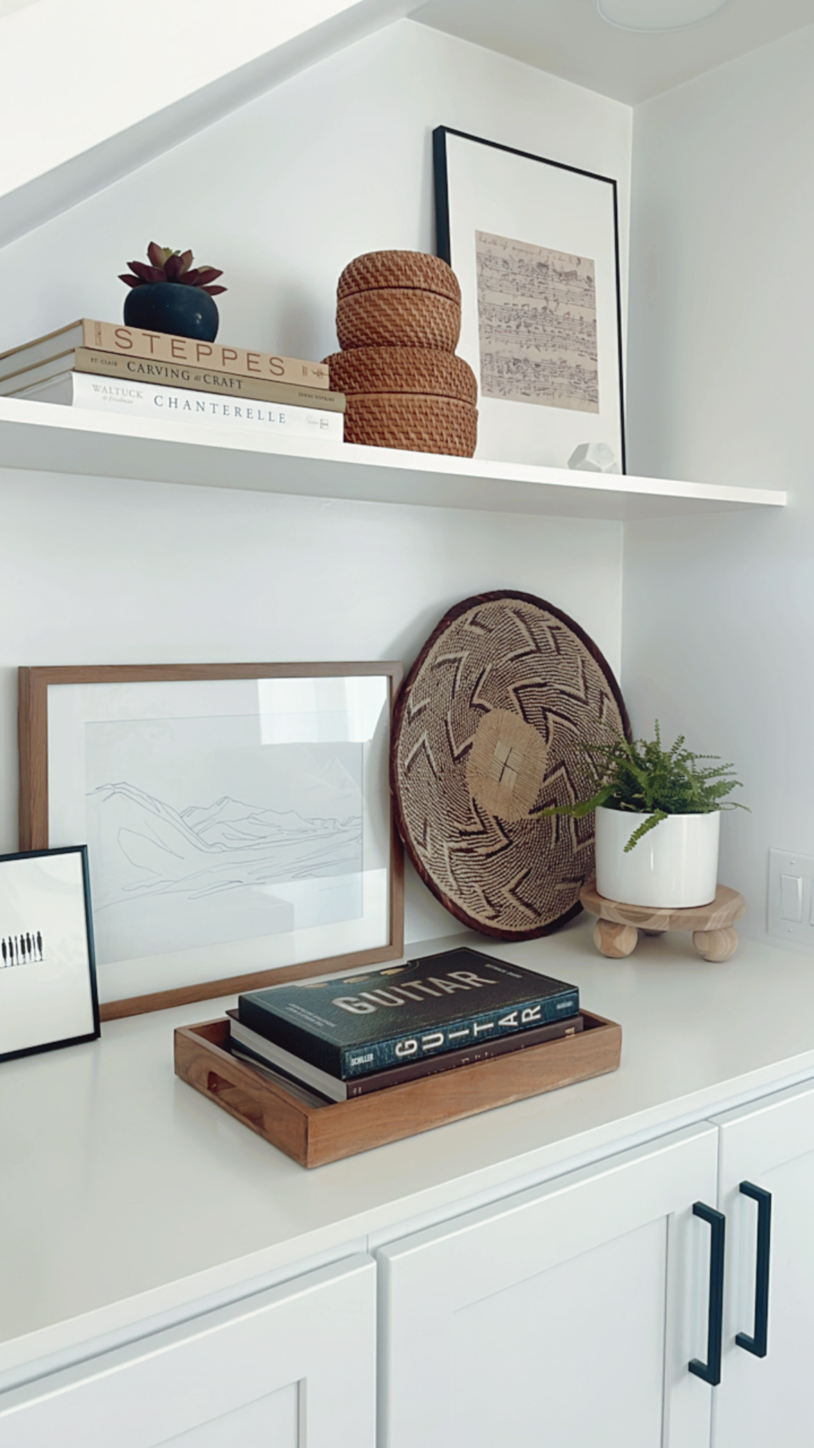
The base of this new built-in cabinet offers hidden storage that now looks purposefully integrated into the rest of the design. The open shelving above gives the opportunity to add more personality through artwork and accessories.
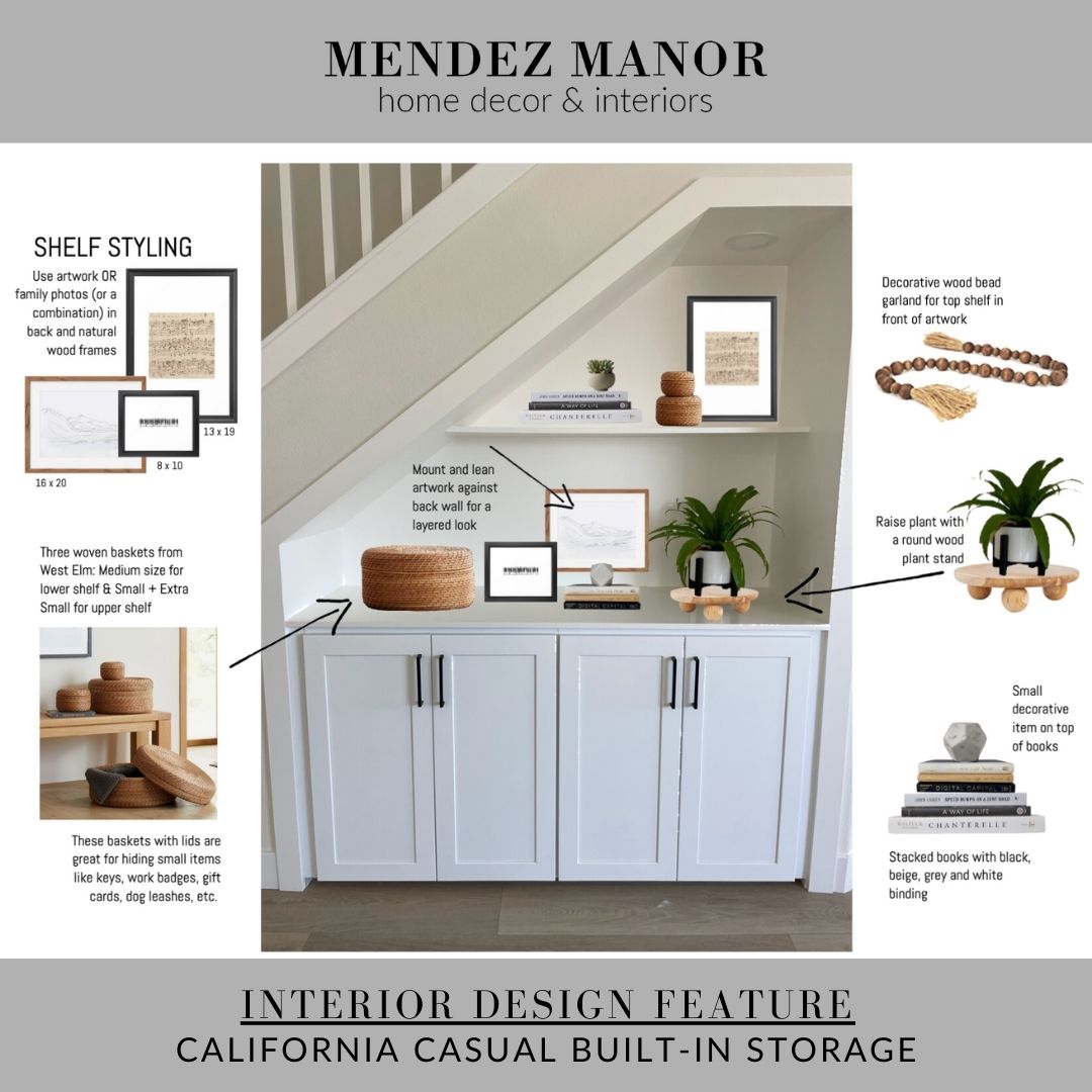
Shop The Look
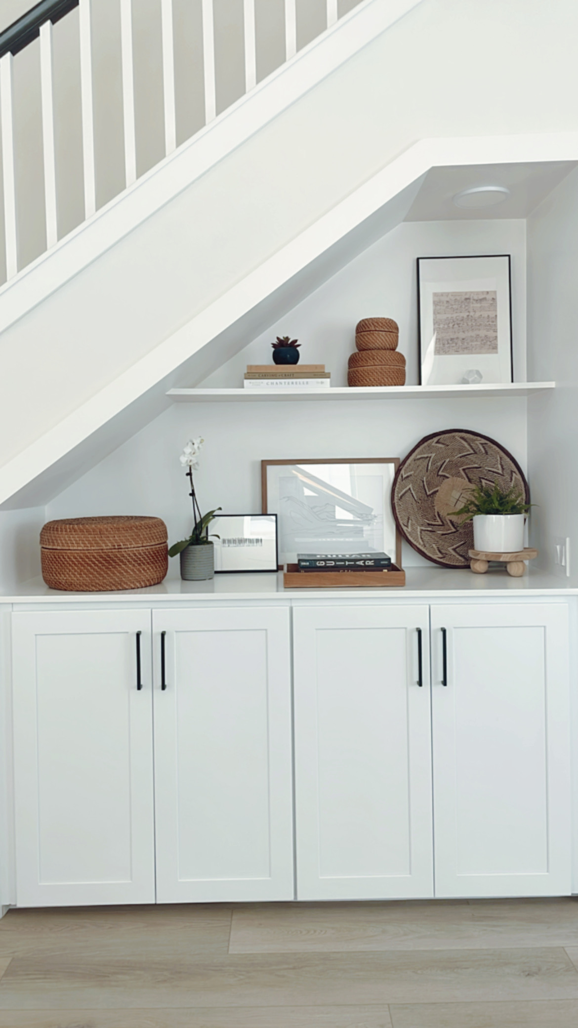
After
The cabinetry and hardware used here is the same style and color that is being used in the client’s kitchen, which is right around the corner. Like the rest of the house, we stayed with a neutral concept for styling, using a combination of white, black, gray and natural wood tones. We were also careful here to include pieces that showed our client’s love for music.
Living Room
In this open concept home, the living room is joined to the music room and the kitchen area. In the initial demolition phase we created an even more open plan by removing the partial wall between the living room and music room.
Before
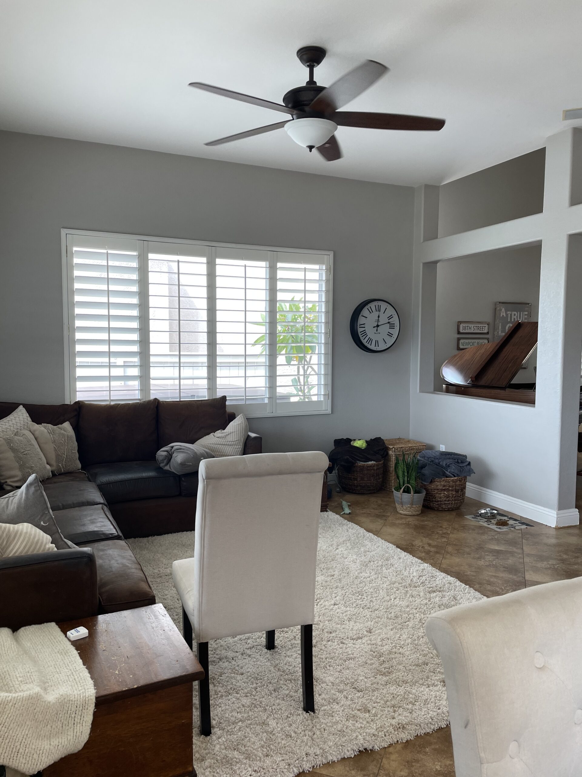
You can see the partial wall in the photo below. It was visually closing off the space and not really needed. The shutters we also closing off quite a bit of natural light, even with the louvers open.
The Design
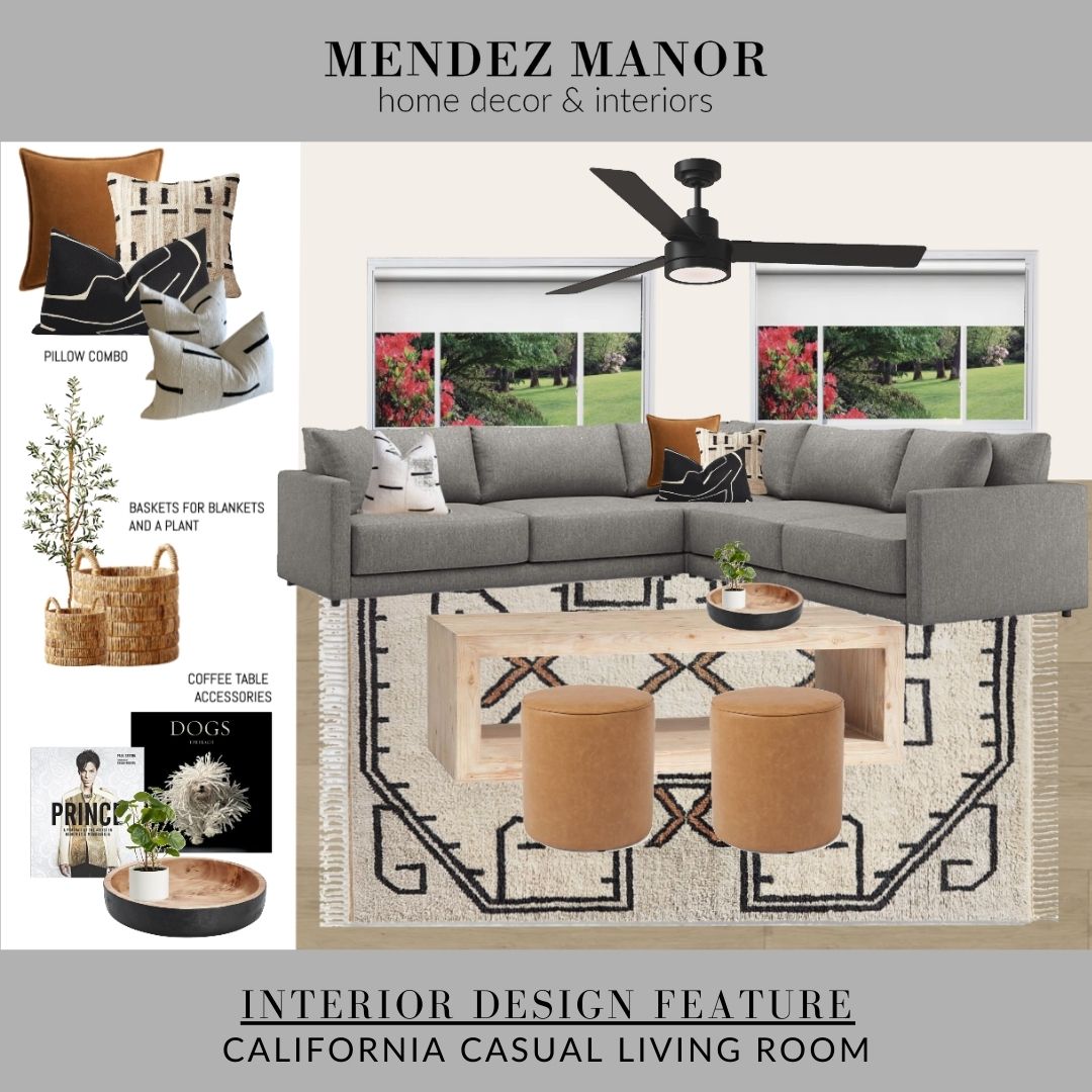
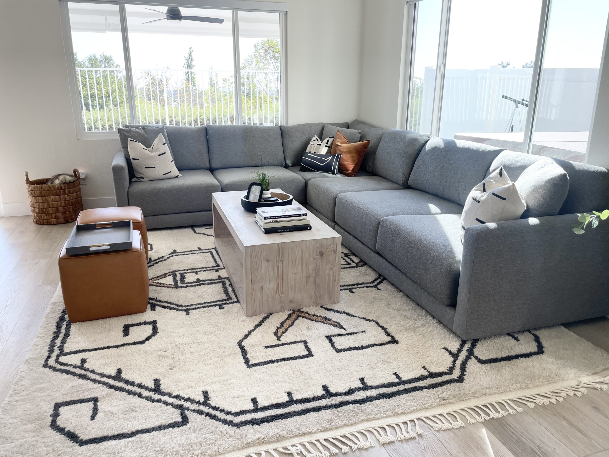
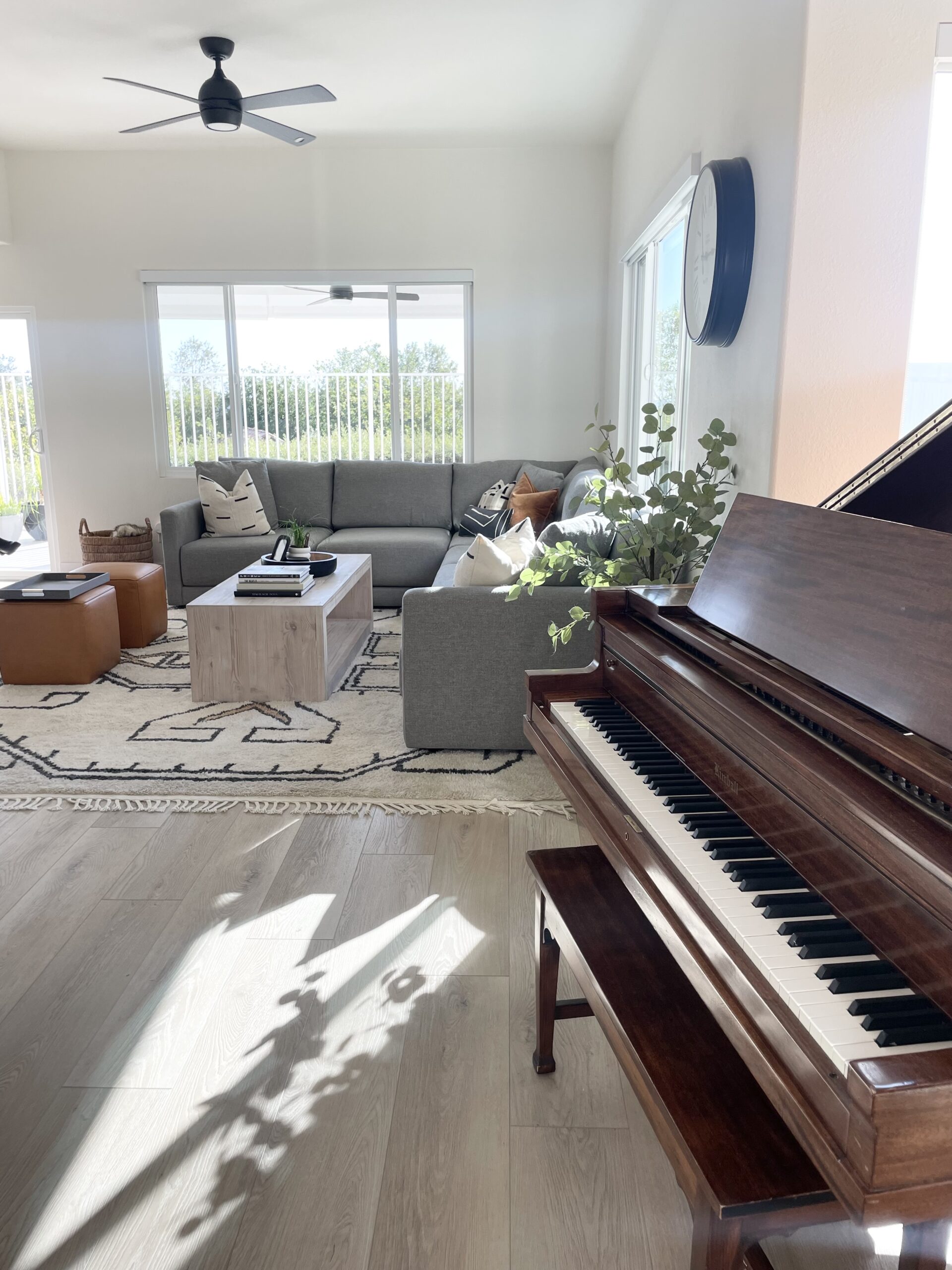
My design for the living room included a larger, more spacious, sectional to fill the room. I recommended the Gather Sectional from Crate & Barrel and we paired it with the Folsom Coffee Table from Pottery Barn. Unfortunately, the area rug we picked is no longer available but it makes a bold statement in the room!

Shop The Look
After
The new furniture arrangement changes the focus of the room towards the kitchen and back patio space. Replacing the shutters with power roller shades lets a lot more light into the room and highlights the view out the back window!
Kitchen
For the kitchen area my client opted to use my on-site services to help choose the finishes. We tool a trip to State Street Distributors in Anaheim to pick out countertops, backsplash tile, cabinet pulls, and flooring. I think the overall look turned out great!
I offer on-site interior design services in Chino Hills and surrounding areas for both clients who have purchased design packages AND anyone who just needs a one time consult to help choose finishes or get advice on design options for their home.
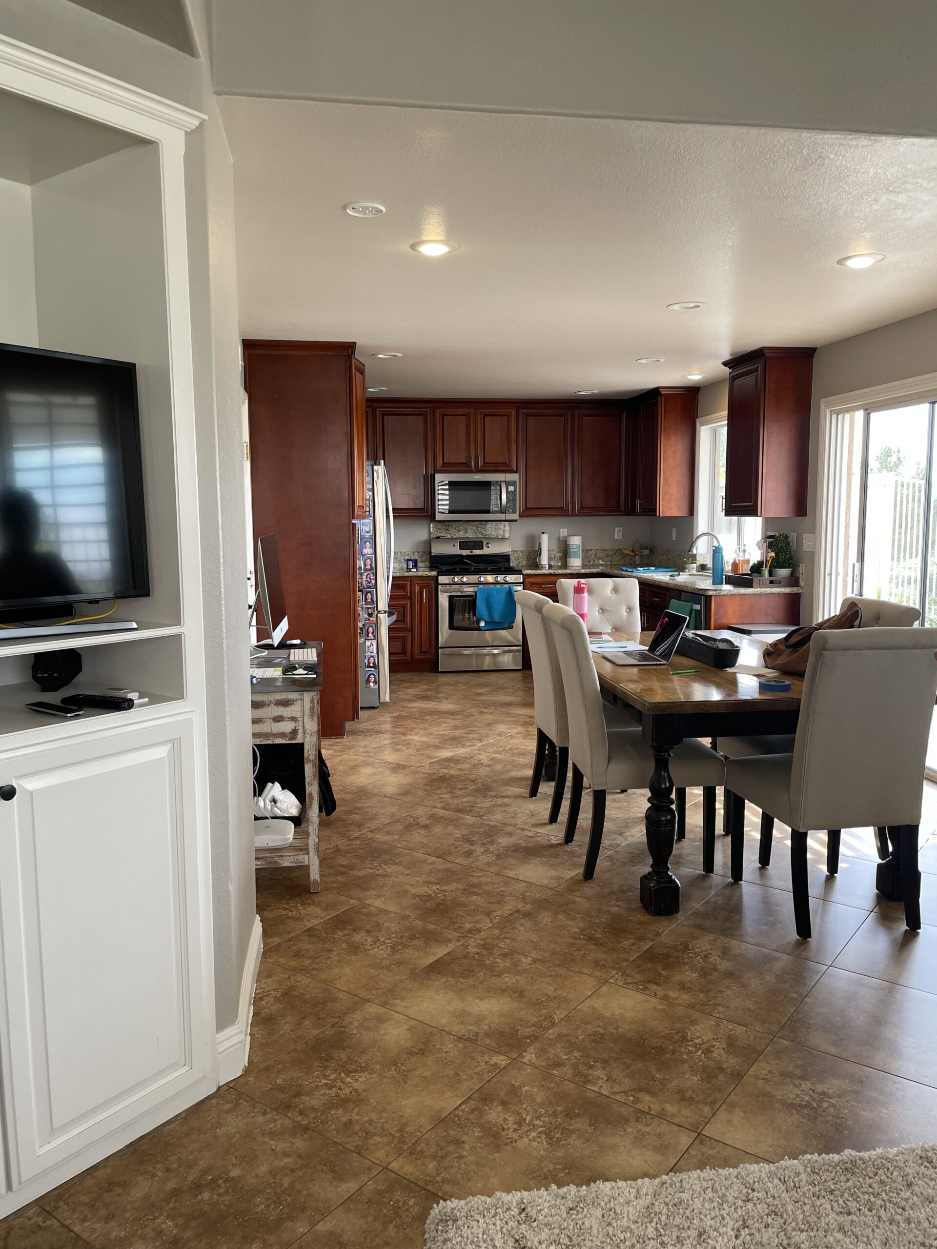
Before
Before the renovation the kitchen had dark cabinets and the same brown tile as the rest of the
After
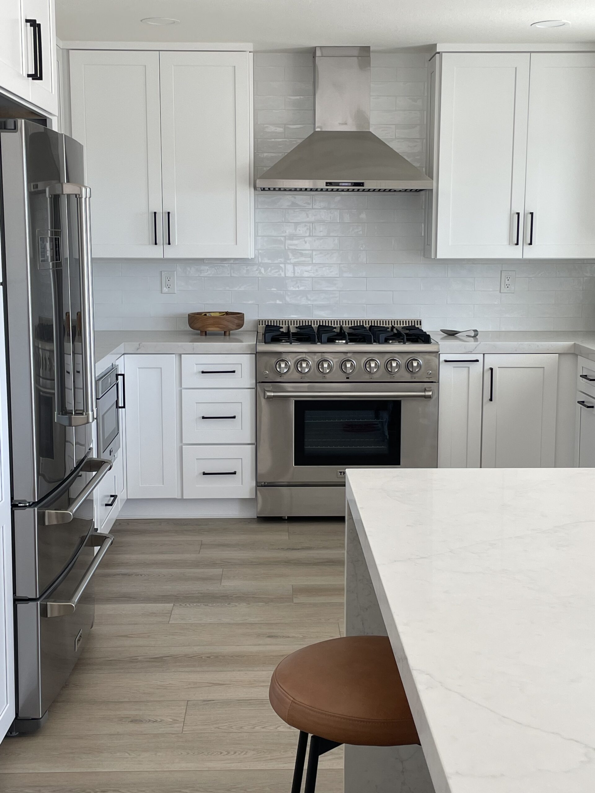
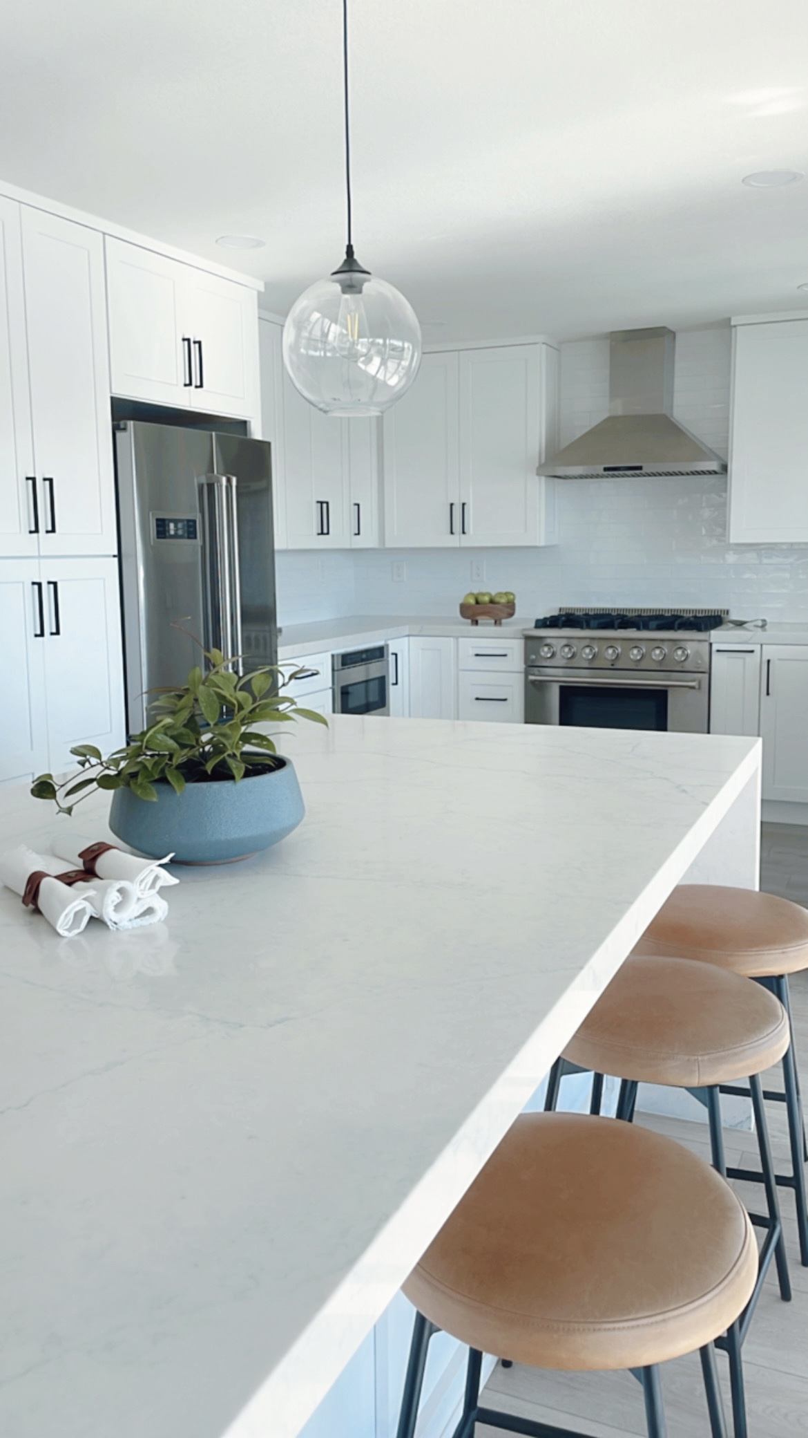
The new kitchen sports classic white cabinets, quartz countertops, a subway tile backsplash and matte black cabinet pulls. My clients opted to replace their traditional dining table with an extra large kitchen island that provides extra work space and sitting area. They also added a second sliding door to maximize their access to the outside. True California living is all about easily moving from your indoor to outdoor spaces!
Powder Room
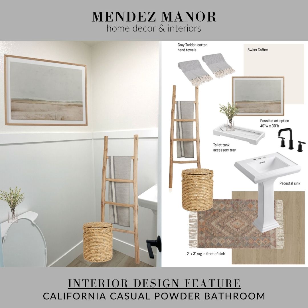
Unfortunately, I don’t have a before picture of the powder room. It’s a small guest bathroom off the music room on the main level of the home. For this design my client utilized my 2D Petite Interior Design Package, which is perfect for small spaces like powder rooms and entryways.
The Design
We suggested a large art print on one wall and a leaning ladder next to the sink for hanging hand towels. The powder room has the same waterproof LPV flooring as the rest of the house, which I recommend doing if you are installing new flooring in a smaller home.
Shop The Look
After
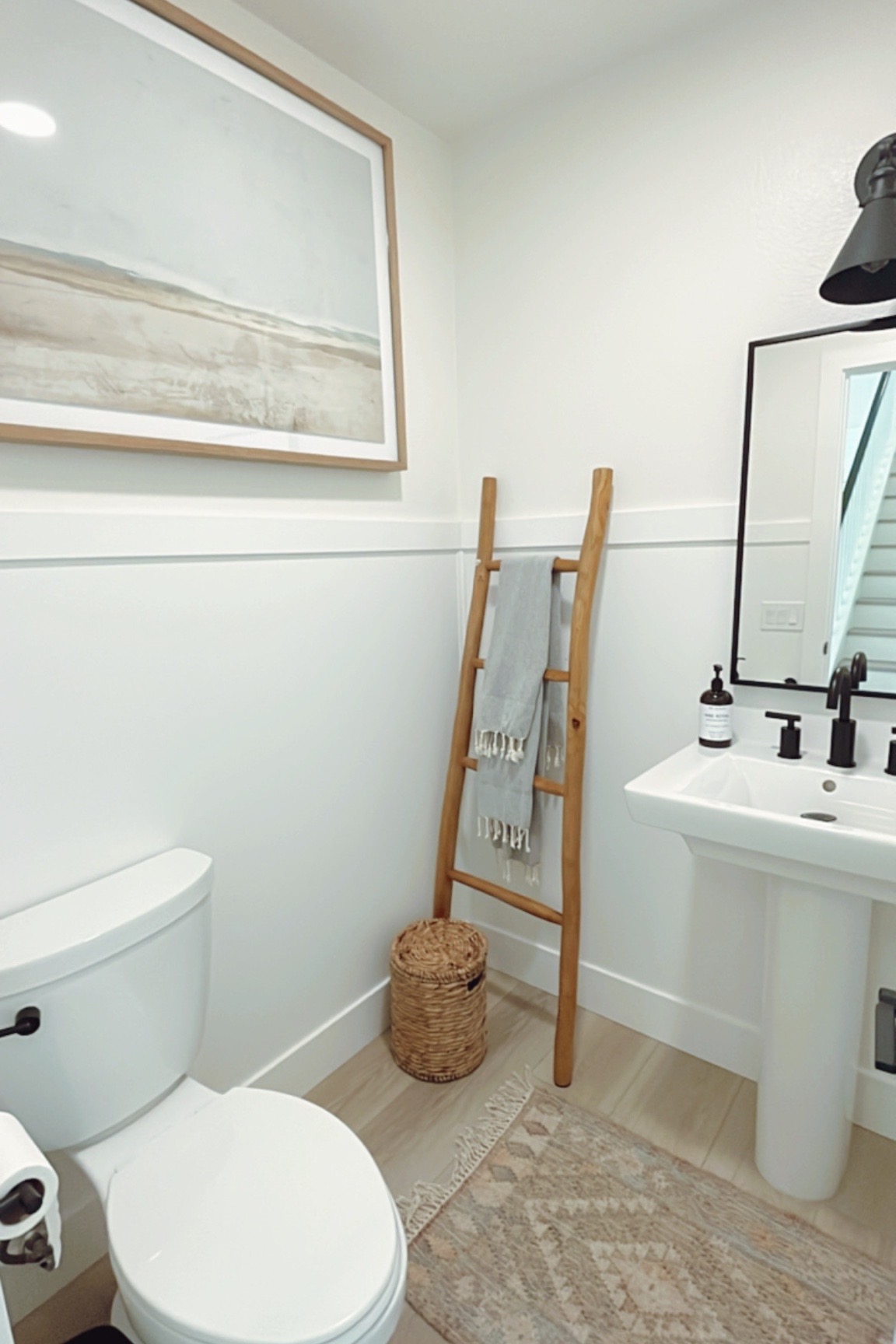
There is a simple wood panel about half way up the wall, which gives the space a very custom look! We used a black framed mirror and black sconce above to match the sink faucet and door hardware. The little area rug is called the Skyline Flatweave Rug from Rejuvenation and it comes in a couple other color ways as well. Perfect for a bathroom!
I had so much fun working on this home renovation project in Foothill Ranch! Stay tuned for the master bedroom portion of the remodel and the beautiful outdoor space!
Online Interior Design
With my online interior design (e-design) services I’m able to help my clients create a professional level of design throughout their home. My team and I will work within your budget & preferences to create a cohesive design plan tailored to your style. I will stick with you for guidance and consultation as you bring your design to life. Check out our Get Started page to learn more about our process.
You will have direct access to lead designer, Nicole Mendez throughout the whole process. Multiple revisions are included with each package to ensure you are completely happy with the end result!
With online interior design I am able to serve clients all over California and the rest of the United States. In addition, my on-site interior design services allow me to meet with locals to help choose items like, flooring, tile, fixtures, and furniture in person.
My last few interior design projects have been in local southern California cities like Lake Arrowhead, Pasadena, Chino Hills, Foothill Ranch, Claremont, Costa Mesa, Irvine, Newport Beach, and Los Alamitos.

